Introduction:
Data visualization is a powerful tool for making sense of large datasets and communicating insights effectively. Excel offers a variety of charting options to help you visualize your data in a clear and compelling manner. In this article, we'll explore how to create and customize charts and graphs in Excel to better understand your data and communicate your findings.

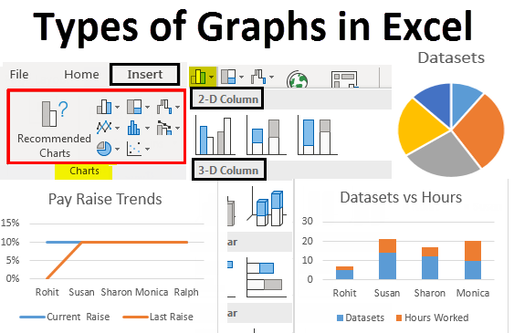
Creating Various Types of Charts:
Excel provides a range of chart types to suit different data visualization needs. We'll cover the most commonly used charts, including bar charts, line charts, pie charts, scatter plots, and more. Each chart type has its unique strengths and applications, and we'll discuss when to use each type based on the nature of your data and the insights you want to convey.
Formatting Charts for Clarity and Aesthetics:
In addition to selecting the right chart type, it's essential to format your charts effectively to enhance clarity and aesthetics. We'll explore various formatting options available in Excel, including adjusting colors, fonts, gridlines, and axis labels. We'll also discuss how to add titles, legends, and data labels to make your charts more informative and visually appealing.

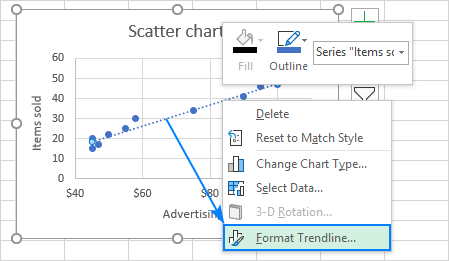
Adding Trendlines and Data Labels:
Trendlines are useful for identifying patterns and trends in your data, such as linear or exponential growth. Excel allows you to add trendlines to your charts with just a few clicks, enabling you to visualize trends and make predictions based on historical data. We'll also cover how to add data labels to your charts to display specific data points or values directly on the chart, making it easier to interpret.
Tips for Effective Data Visualization:
Effective data visualization goes beyond simply creating charts; it's about conveying meaningful insights to your audience. We'll share tips and best practices for creating effective visualizations in Excel, such as choosing appropriate chart types, simplifying complex data, avoiding clutter, and focusing on the most critical insights. We'll also discuss how to use color, contrast, and hierarchy to draw attention to key findings.
Conclusion:
Data visualization is a powerful tool for uncovering insights, identifying trends, and communicating findings effectively. In this article, we've explored how to create and customize charts and graphs in Excel to visualize your data in a clear and compelling manner. By selecting the right chart types, formatting charts for clarity and aesthetics, and following best practices for effective data visualization, you can leverage Excel's charting capabilities to unlock valuable insights and make informed decisions.
Comments
Post a Comment